
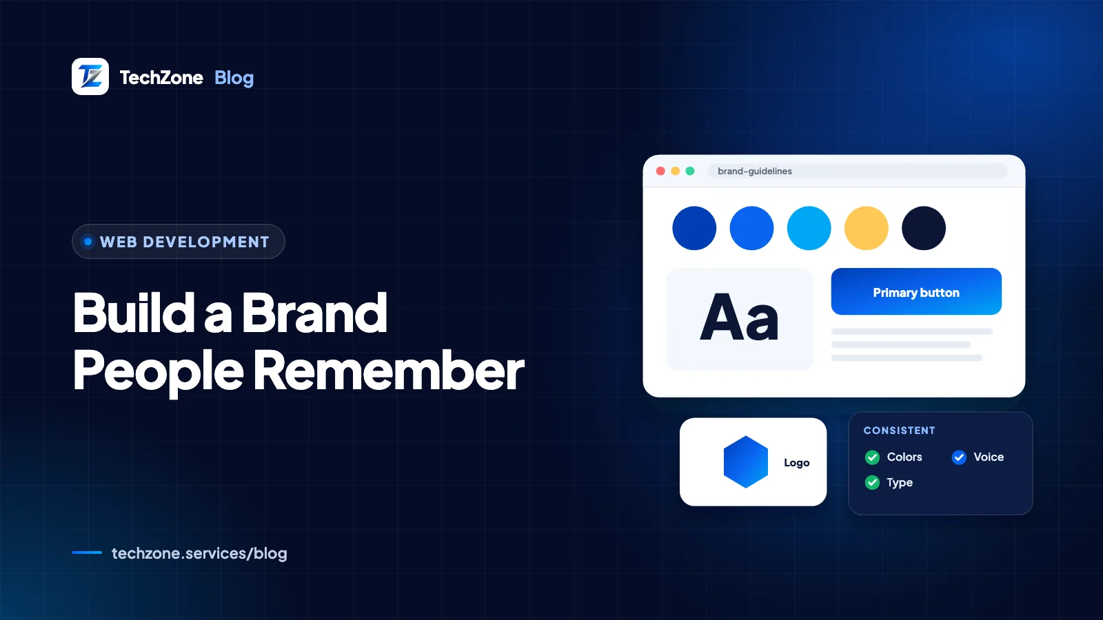
A brand identity for small business is the set of assets that makes you recognizable wherever customers meet you: a logo in several versions, a small color palette, one or two fonts, a photo style and a consistent voice. Build them in that order after a short strategy step, then write the rules down in a short guideline.
Your brand is what people think and say about you; your identity is the part you control. A logo on its own isn’t an identity. Without rules for color, type and tone, every new flyer, post and web page drifts a little further from the last.
This guide walks through each step with the specs that matter in 2026, from accessible color contrast to favicon sizes, and ends with a guidelines template and a checklist of what a designer should hand over.
Key takeaways
- Decide who you serve, what makes you different and how you want to sound before anyone opens a design tool.
- You need several logo versions, including a square icon that still reads inside a small circle on social profiles and WhatsApp.
- Under WCAG, body text needs at least 4.5:1 contrast against its background, so test brand colors before using them for text.
- One or two properly licensed font families and three or four voice traits cover most small business needs.
- Write the rules into a short brand guideline and apply it to your website, Google Business Profile, social profiles, WhatsApp and print.
What is brand identity, and how is it different from a logo?
Brand identity is the deliberate system of visuals and language you use everywhere; the logo is one piece of it. Your brand is the reputation that forms in customers’ minds from that identity plus every experience they have with you.
| Term | What it is | Who controls it |
|---|---|---|
| Brand | The overall impression and reputation customers hold | Customers, shaped by everything you do |
| Brand identity | The visual and verbal system: logo, colors, fonts, imagery, voice | You |
| Logo | The mark that signs your work | You, as part of the identity |
For a small business, the identity has a practical job: be recognized quickly, look trustworthy enough to contact, and stay consistent when different people (you, a staff member, a freelancer) create materials.
Where does creating a brand identity for a small business start?
It starts with four decisions on paper: who you serve, what you offer that competitors don’t, the personality you want to project and the name you’ll trade under. Those answers become the brief a designer’s concepts are judged against, instead of personal taste.
Write a one-sentence positioning statement
Use this pattern: For [audience] who [need], [business] is the [category] that [main benefit], because [proof]. Example for a made-up business: “For busy families in Islamabad who want healthy lunches, Green Box is the meal service that plans the week’s menu for you, because a nutritionist writes every menu.” If you can’t fill in the proof, fix the offer before the logo.
Pick three or four personality traits
Choose adjectives with a limit attached, such as “friendly, not casual” or “expert, not academic”. The limit is what makes a trait useful: it tells a designer or writer where to stop. These traits drive color, type and voice choices later.
Check competitors and your name
- Screenshot the logos, colors and websites of five local competitors, so you don’t end up looking like the market leader.
- Search trademark databases before you commit to a name or mark: the UK Intellectual Property Office’s trade mark search, the USPTO in the US, WIPO’s Global Brand Database, or IPO-Pakistan’s Trade Marks Registry.
- Check that the domain and social handles you want are free, or that a close, consistent variant is.
What logo versions does a small business need?
You need one primary logo plus a few variations for different spaces, in vector and web formats. The version people forget is the small square icon, which is what appears in browser tabs, social profiles and WhatsApp chats.
| Version | Where it’s used | What to check |
|---|---|---|
| Primary logo | Website header, signage, proposals | Symbol and name together, readable at a glance |
| Horizontal or stacked | Narrow headers, email signatures, square posts | Same elements rearranged, not redrawn |
| Icon or monogram | Favicon, social and WhatsApp profile pictures | Reads at small sizes and inside a circle |
| One-color (black and reversed white) | Stamps, embroidery, dark photos, invoices | Works with no color at all |
- Formats: SVG for the website, PDF or EPS for print, and transparent PNG for everyday use.
- Favicon: Google requires a square favicon of at least 8 x 8 pixels and recommends one larger than 48 x 48 pixels, according to its favicon guidelines.
- Profile pictures: Facebook crops Page profile pictures to a circle, and WhatsApp and Instagram show profile photos as circles too, so test your icon inside a circle before approving it.
- Rules: set a clear space around the logo and a minimum size below which you switch to the icon.
How do you choose logo colors and fonts that work?
Pick a small palette with defined roles, record exact codes for screen and print, and test text contrast before signing off. For type, one or two font families you’re licensed to use everywhere are enough.
Build a palette with roles
- One primary color that people will associate with you.
- One or two accent colors for buttons, highlights and charts.
- Neutrals: a dark text color, a light background and a border gray.
- Codes for every color: HEX for the web, RGB for screens, CMYK for print, and a Pantone reference if you print spot colors.
Check contrast before you commit
Bright brand colors can fail as text colors. WCAG 2.2, the W3C accessibility standard, sets minimum contrast ratios; its contrast guidance exempts text inside a logo but not your buttons or headings. Test each text and background pair in a free tool such as the WebAIM Contrast Checker.
| Use | Minimum contrast | Typical brand check |
|---|---|---|
| Body text and small labels | 4.5:1 | Dark gray text on your light background |
| Large text (about 24px, or about 18.5px bold) | 3:1 | A headline in your primary color |
| Buttons, form borders and meaningful icons | 3:1 against adjacent colors | An outlined button in your accent color |
| Text that is part of the logo | No requirement | Still keep it legible |
Choose fonts you can use everywhere
Pick a heading font with character and a plain, readable body font, or one family used in two weights. Check the license covers print, web and app use: open-source families such as those on Google Fonts can be used commercially, while paid fonts often need separate desktop and web licenses bought in your business’s name.
Pakistan note
If you publish in Urdu or Arabic as well as English, test your fonts in both scripts before you finalize them. Google Fonts offers open-source families such as Noto Nastaliq Urdu and Noto Naskh Arabic, and your guideline should name which font to use for each language.
How should your brand look and sound beyond the logo?
Photos, icons and words carry as much of your identity as the logo. Define a photo style and a voice with real examples, so anyone creating content can match them.
Imagery
Real photos of your team, premises and work beat generic stock images. Keep lighting, framing and editing consistent, choose one icon style (line or filled, not both), and avoid heavy filters: Google asks for Business Profile photos that are in focus, well lit and without significant alterations.
Voice and tone
Voice is your constant personality; tone adjusts to the moment, calmer when replying to a complaint and livelier in a promotion. Turn your traits into a table like this one.
| Trait | This | Not this | Example line |
|---|---|---|---|
| Friendly | Warm, plain words | Slang or forced jokes | “Thanks for your order, Sara. It ships tomorrow.” |
| Expert | Specific and confident | Jargon or hedging | “We’ll test the repair before we leave.” |
| Direct | Short sentences, a clear next step | Pushy sales language | “Reply YES to confirm your appointment.” |
What should brand guidelines for a small business include?
A small business needs a short, practical guideline with the rules someone needs to produce materials without asking you. A few pages is usually enough. Copy this outline as your template.
| Section | What to include | Who uses it |
|---|---|---|
| Brand basics | Positioning statement, audience, personality traits | Everyone, including new staff |
| Logo | All versions, clear space, minimum size, misuse examples (stretching, recoloring, effects) | Designers, printers, web developers |
| Color | HEX, RGB, CMYK and Pantone codes, color roles, approved text pairs | Designers and developers |
| Typography | Fonts, weights, heading and body sizes, fallback fonts, license notes | Designers and developers |
| Imagery | Photo style, example photos, icon style, what to avoid | Photographers and social media staff |
| Voice and tone | Voice chart, sample replies, words to avoid | Anyone writing posts, replies or emails |
| Templates | Social posts, email signature, invoice, proposal, business card | Staff and freelancers |
| File library | Where master files live and who controls access | Everyone |
Store the guideline PDF and master files in one shared folder you own. Design tools help too: Canva’s Brand Kit (check which plans include it) keeps your logos, colors and fonts one click away for anyone making posts.
How do you apply your brand identity consistently?
Set the identity up once in each platform’s brand settings, then work from templates so nobody recreates an asset from memory. Start with the channels customers see most.
| Channel | Where to set it | What to check |
|---|---|---|
| WordPress website | Styles in the Site Editor (block themes), or Site Settings, then Global Colors and Global Fonts in Elementor | Favicon set; text colors pass contrast |
| Shopify store | Settings, then General, then Brand assets; plus theme settings in the theme editor | Logo and square logo show in checkout and email notifications |
| Google Business Profile | Logo and cover photo on your profile | Business name matches your signage, with no tagline added |
| Social profiles | Profile picture, cover images, bio | Icon survives a circular crop; same handle everywhere |
| WhatsApp Business | Business profile: photo, description, hours, catalog | Greeting and away messages written in your voice |
| Email and documents | Signature, invoice and proposal templates | Same logo file, fonts and colors |
| Print and signage | Files supplied to printers | CMYK or Pantone files, correct bleed, one-color version if needed |
For profile-specific advice, see our Google Business Profile optimization checklist and our guide to social media marketing for small businesses. If a new website is next, hand the guideline over at the brief stage; the website development process shows where design fits. A consistent look won’t fix a confusing site, though, which is what a UX audit checks.
Should you hire a designer or build your brand yourself?
Do it yourself when you’re testing an idea on a small budget. Hire a designer before you spend on signage, packaging, vehicle wraps or a new website, because those make changing your identity expensive later.
- DIY with templates: pre-launch or testing demand, with a plan to revisit once the business proves itself.
- Freelance designer: you need a distinctive logo and a basic kit, and you can manage feedback yourself.
- Agency: you want the identity plus a website, social templates and rollout across channels, which is the work our branding and UI/UX design team does.
What a designer should hand over
- Every logo version in SVG, PDF or EPS, and transparent PNG.
- Color codes in HEX, RGB, CMYK and Pantone, with approved pairings.
- Font names, weights and licenses, or links to buy them in your name.
- The brand guideline as a PDF, plus editable templates.
- Source files (Figma, Illustrator or similar).
- A written transfer of copyright in the final designs.
That last point matters. The UK government’s copyright ownership guidance says that when you commission work, the person who created it owns the copyright first, and only a written agreement changes that. Ask for a written proposal listing deliverables, concept and revision rounds, and the timeline.
How TechZone can help
TechZone’s design team helps small businesses build identities they can actually use: positioning, logo versions, accessible color palettes, fonts, voice guidelines and ready-made templates. We can then apply them to your website, Google Business Profile and social profiles. We begin with a free consultation, then send a written proposal listing the deliverables and files you’ll receive. Explore our UI/UX design and branding services, or book a free 30-minute consultation to talk through your brand.
Frequently asked questions
How much does a brand identity cost for a small business?
The cost of a brand identity for a small business depends on how much research is involved, how many logo concepts and revision rounds you get, and how many applications are included, such as templates, signage or packaging. Ask two or three designers for written proposals against the same brief, and compare the deliverables list rather than the headline price.
How long does it take to create a brand identity?
Creating a brand identity takes as long as its strategy, concept, revision and file-preparation stages, and the biggest variable is usually how quickly feedback comes back. A logo refresh moves faster than a new name, logo and full guideline. Ask the designer for a dated timeline in the proposal, including when you need to give feedback.
Can I trademark my small business logo?
A small business can usually register its logo as a trademark with the national intellectual property office, such as the USPTO in the US, the UK Intellectual Property Office or IPO-Pakistan. Registration is country by country, so file where you trade. Search existing marks before finalizing the design, and consider advice from a trademark attorney for anything complex.
How often should a small business refresh its brand?
A small business has no fixed schedule for a brand refresh. Refresh when the business changes, for example new services or markets, when the logo fails on small digital surfaces, or when the look no longer matches your prices and customers. Evolve the existing identity where you can, because a complete change throws away the recognition you’ve built.
What is the difference between brand identity and brand image?
Brand identity is what a business designs and projects: its logo, colors, fonts, imagery and voice. Brand image is how customers actually perceive the business, based on that identity plus their experiences with it. A strong identity gives customers consistent signals, but the brand image only improves when the service matches what the identity promises.
Sources and further reading
- Understanding Success Criterion 1.4.3: Contrast (Minimum) – W3C Web Accessibility Initiative
- Define a favicon to show in search results – Google Search Central
- Manage your Business Profile photos and videos – Google Business Profile Help
- Facebook Page profile picture and cover photo dimensions – Facebook Help Center
- Managing your brand assets – Shopify Help Center
- Ownership of copyright works – GOV.UK (Intellectual Property Office)